In the sport of volleyball, especially the indoor edition, we are now accustomed to seeing a volleyball in three different styles. The traditional 18-panel design (photo on the left), the Mizuno MV200 8-panel design (photo in the middle) and the Molten FLISTATEC 5000 6-panel (photo on the right) are the three designs.
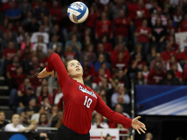
Courtesy Nebraska Athletics
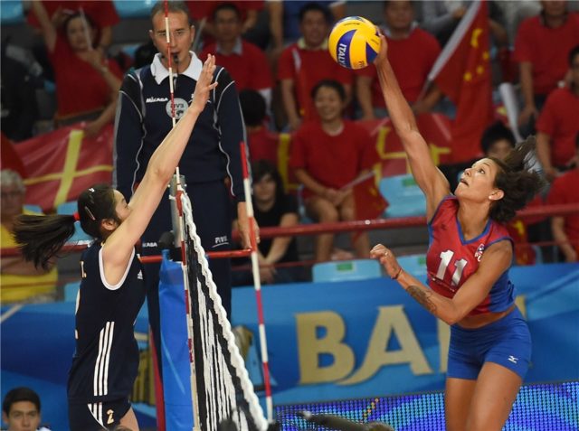
Courtesy of FIVB

Courtesy of Andy Wilhelm/UCSD Athletics
Mizuno introduced the MV200 design in 2008 in time for the Beijing Olympics. The MV200 ball is noted for its blue and gold design and curving panels. The Molton FLISTATEC color pattern looks very similar to a peppermint swirl and was introduced in 2009.
So with the two newest designs being nearly ten years old, I asked myself a question, “Have professional teams around the world switched their logos to one of the newer designs?” With this question I also added the following, “Do teams use a circle to imply a volleyball as well?” So this allowed me to come up with five categories: 18-panel design, Mikasa design, Molten design, circle or none. I then went through the different professional leagues to look at the league logo as well and incorporate those as well.
I did leave a couple of leagues out due to the clubs using a soccer team affiliation, such as in Greece and Turkey, which are predominantly affiliated with those clubs. Also Chinese teams do not really use a logo for their club, excluding Bayi, which is essentially a government logo for the military.
![]()
So what did I find? Out of a total 334 teams and league logos, 154 or 46.1% use the 18-panel volleyball design. Second at 103 or 30.8% were teams or leagues that did not use a volleyball in their logo. This did not surprise me as some teams are affiliated with a sports club or just want an aggressive logo without identifying the sport. Teams or leagues using a circle kind of surprised me with 48 or 14.4%. The circle implies a volleyball, which also was similar in the past with the old World Grand Prix logo.
Courtesy of FIVB
Only 28 teams or 8.4% have switched to the Mikasa 8-panel design, with six each in Russia and France. Amazingly only one team, U-net E-Work Busto Arsizio in the Italian Women’s A1 league uses the Molten design, which you can see at the top of the page.
I would think that the reasoning for the 18-panel design being the most used is that many of these teams were created prior to the Mikasa or Molten designs. As those teams have history or a long history hopefully, it does not make sense for them to change the ball in their logo. However some teams have already made the switch. Racing Cannes has shifted their logo from the 18-panel to the Mikasa design in the last couple of years. Additionally the 18-panel design may be well known to people through their school years having tried the sport in physical education classes.