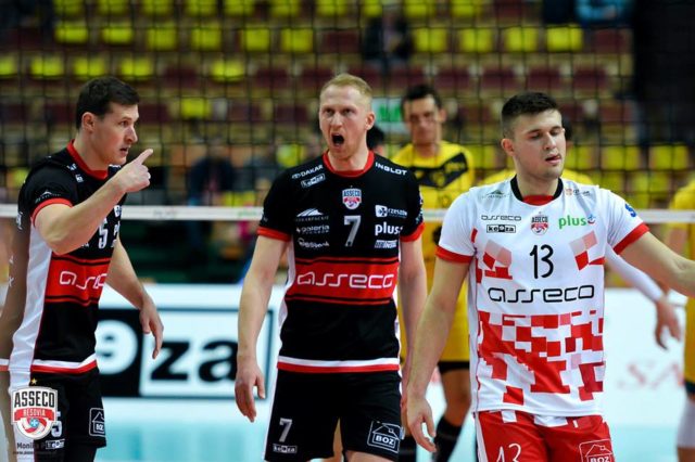
With volleyball rules requiring liberos wear a different color jersey than their teammates, often teams will just have the libero wear the dark or light version of the jersey. In Italy and Poland allow teams to use a completely different design than that of their teammates. In Italy, teams can have different sponsors just for the libero jersey.
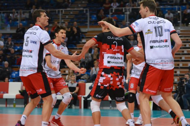
Poland’s Asseco Resovia Rzeszow‘s libero jerseys are very different from the red and white stripes that the team in known for. Asseco is placed on both jerseys in black on a white chest panel. Both libero jerseys use different shades of red, pink and white to emphasize the teams red and white colors.

Courtesy of Asseco Resovia Rzeszow
However, when I look at the pattern, I think immediately of Post-It Notes because of the shapes of the colors. There are so many squares of various sizes, or implied shapes, it makes it hard to think of what the pattern means otherwise.
I do like the look of the jersey, because it is very distinct and memorable with the Post-It design (intended or unintended). However there is one other thing that is driving me crazy and that is the almost hand drawn font for the numbers. Looking at the Asseco players in black above with their beveled grey numbers just look great. Now compare that with the libero number font, and the liberos really look almost like clowns. If you put the beveled number on the libero uniform, it would really pop. Instead, you are kind of let down because the font does not match the others on court and it is not even close to the Asseco font either.

Courtesy of Asseco Resovia Rzeszow & CEV
From the back the libero font just looks too thin when compared to the Post-Its around it. The beveled font would work better as it was thicker.

Leave a Reply