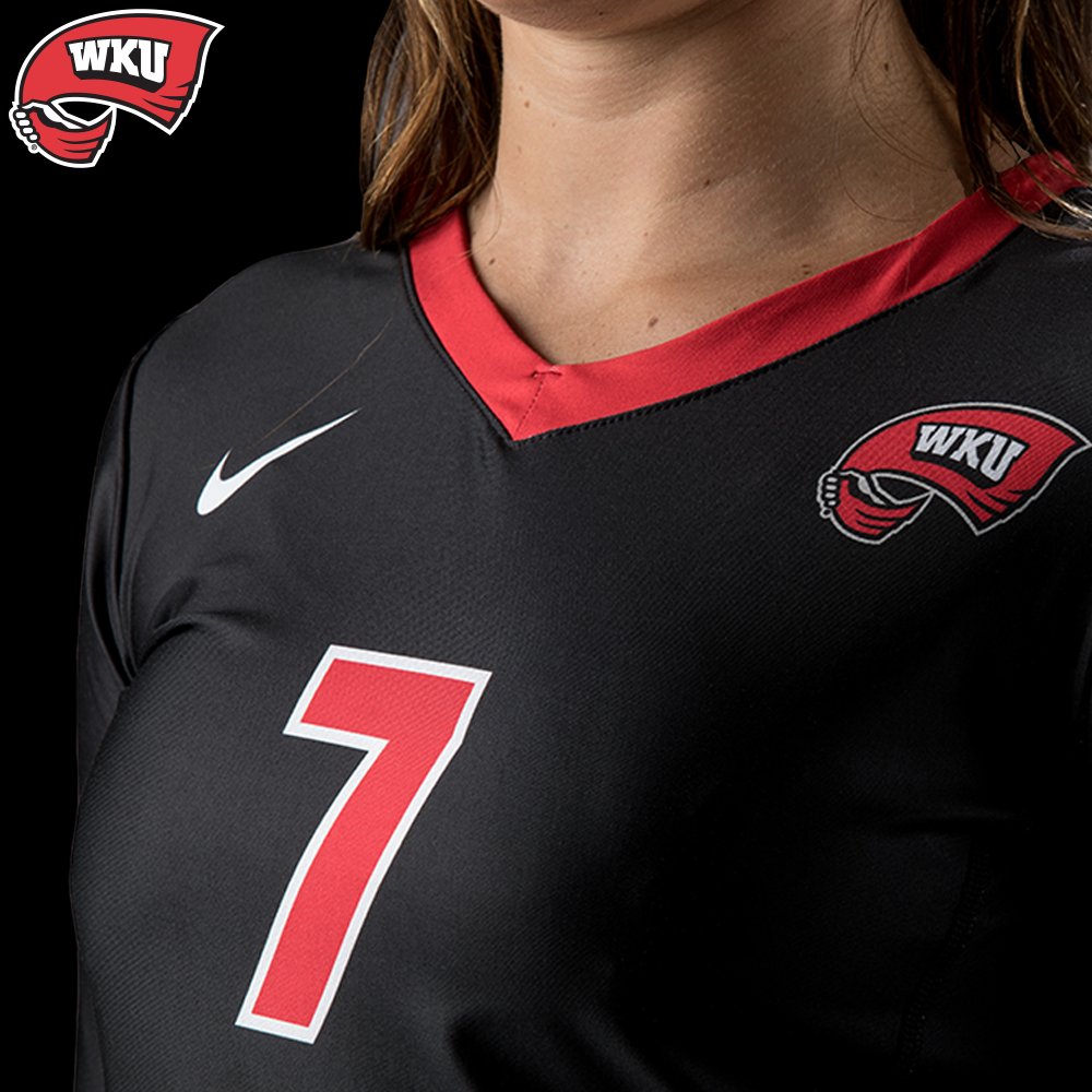
Defending Conference USA Regular Season and Tournament Champions, Western Kentucky University Lady Toppers have introduced their 2017 look designed by Nike. The uniforms utilize the three school colors of red, while and black. It looks like that Nike is using a V shaped front collar in the front with a rounded neck in the back.
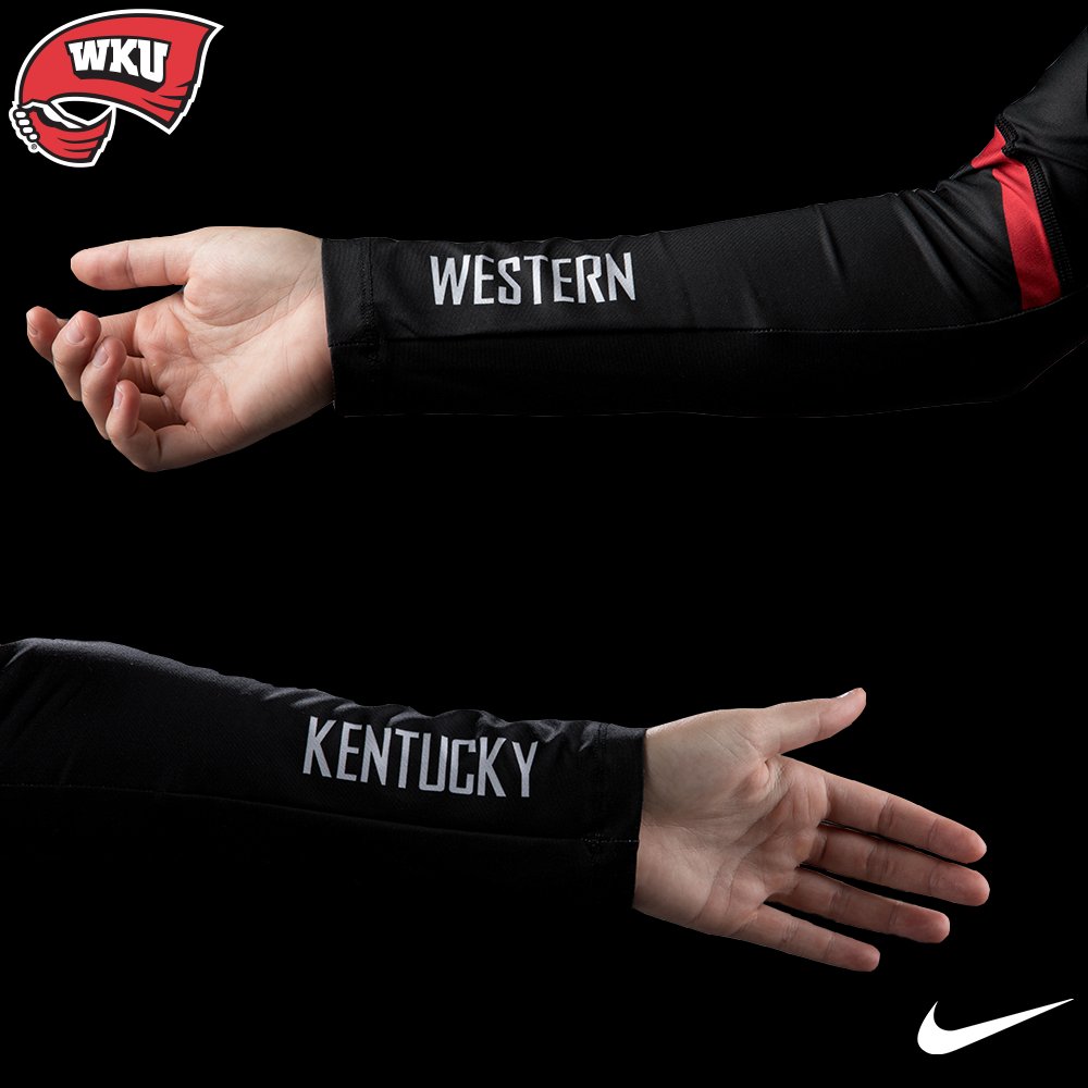
What is interesting is that two of the uniforms, the white and red ones, do not have sleeves, while the black uniform has sleeves. Maybe this only to be used by the libero, but during their intersquad scrimmage open to their fans, every player wore them. Additionally the sleeved uniforms have Western and Kentucky on the inside of the forearms. However based on the look Kentucky is on the left and Western is on the right, did they mistake this?

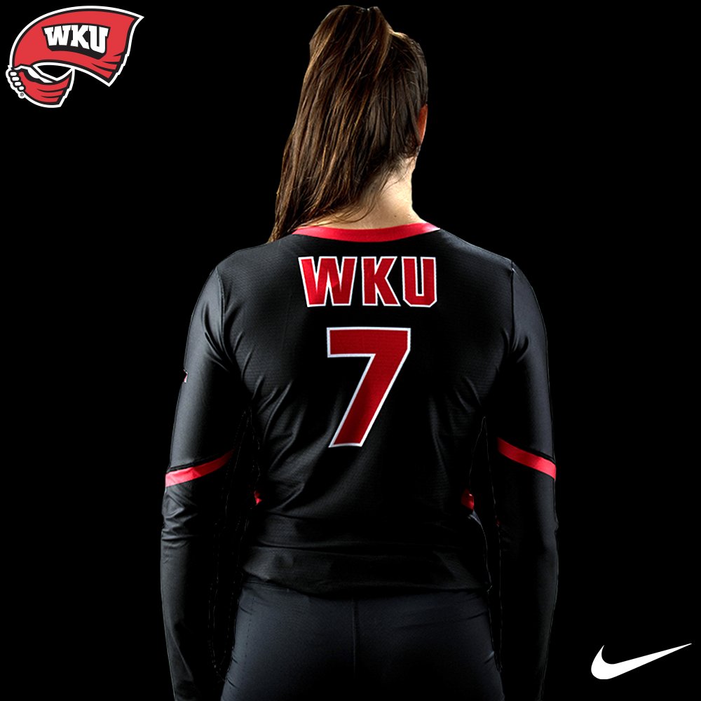
On the white shirt, the red numbers and letters are outlined in black. While on the red shirt, the black letters are outlined in white, but the numbers are white outlined in black. A little odd, because usually teams try to match those things. On the black uniform, the numbers are in red with a white outline. The WKU Red Towel logo is placed on the right side of the chest.

The WKU letters have been moved across the top of the back and using the red letters with a white outline.

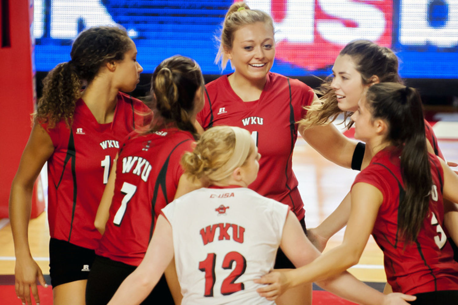
I have to say this is an upgrade from the Lady Toppers 2016 uniforms from Russell Athletic. Russell’s headquarters are in the same town as Western Kentucky, but after last year the University was open to finding a new supplier. Getting back to the 2016 uniform, the numbers appear to have drop shadows and really odd lines.

Again the change to Nike is an improvement in their look and possibly can it help Western Kentucky repeat as Conference USA champions?
Leave a Reply