For the 2017 season, the University of Texas Longhorns are starting the season at the top of the AVCA NCAA Division I rankings. Additionally they are favored to win the Big XII (Twelve) Conference as well. However, how do they look on the court, fashionable?
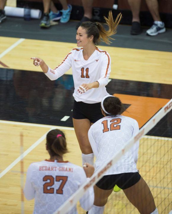
The Longhorns are known for their distinct burnt orange and white color scheme. Black is used as an alternate color for the Longhorns. This years white jersey, as shown above, looks very similar to last season’s look. However, there are three main differences. First, the lines on the sleeves are burnt orange, where as the 2016 version was without lines on the sleeves. Secondly, the lines that were on the body in 2016 were black and have been dropped. It looks very clean just with those two differences. The third is a change in the color for the numbers from black with an burnt orange outline, to a burnt orange with a black outline. I want to say that if the number did not have the outline, it would look fine.

Courtesy University of Texas
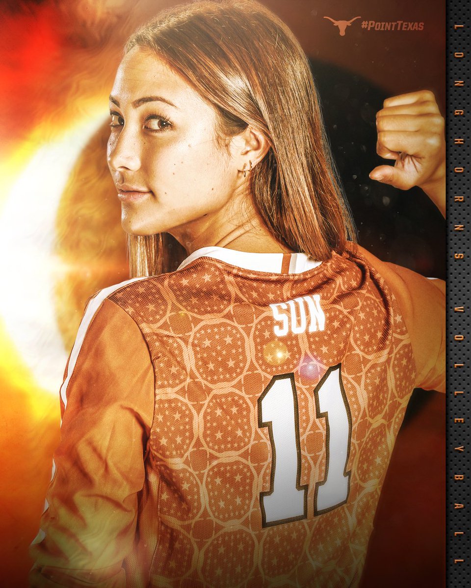
Moving onto the burnt orange jersey, the lettering and numbers are in white with black outlines. The lines on the sleeves are in white only. Because of the white neckline and Nike logo, which does not have an outline, it just looks a little off. Drop the outline and it looks great.

Courtesy University of Texas
Also, Texas is using a pattern on the back on their uniforms. Additionally, Texas has now shifted from a team name on the back, such as Texas, to the player’s name. Still it is odd having the difference between the outline with the numbers and without the outline on the player’s name.

Courtesy University of Texas
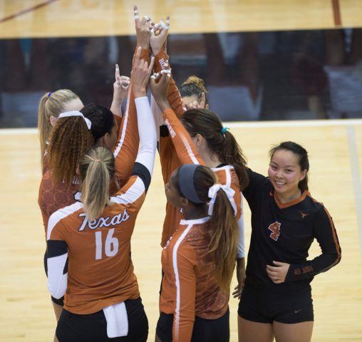
With the alternate black jersey, the Longhorns have burnt orange sleeve lines and burnt orange numbers with white outlines. Again the outline against the rest of the jersey just looks a little off. Additionally in this shot, you can see on player 16 a previous version of the Texas uniform with the Texas script on the back.
Texas as always has high expectations on the court and their look almost matches those expectations.

Leave a Reply