
In the lead-up to the Tokyo Olympics in 2020, the Japanese Volleyball Association is working with their jersey supplier Asics on a four-year plan for the men’s national team or as their nickname in Japanese Ryujin (Dragon God) Nippon. This plan is called a “Star Cluster” for the four years, and hence each year is supposed to show the development and growth of the team towards 2020.
The theme for 2017 is “Light emission,” which is traced to a new star in the galaxy. The colors for this season are:
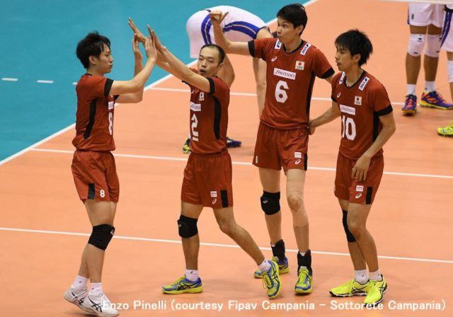
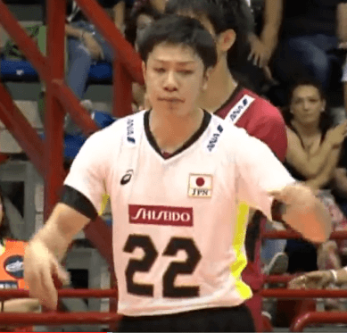
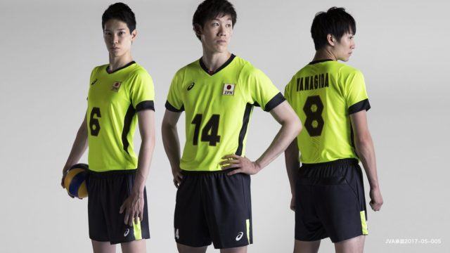
RED
WHITE
FLASH YELLOW
In 2018, the theme will be “Growth”, 2019 “Breakthrough” and in 2020 “Brilliance”. So are they foreshadowing a medal in Japan’s future? We shall see.
One of the oddities about the Japanese uniform is that the back has gold graphic print in the center of it. Asics in their press release stated in Japanese, “The graphic expresses a figure that challenges the world with the team’s oneness.” Additionally, the numbers are outlined in gold as well. The number font has very hard angles for the 6s and 8s with hexagons in the middle of the numbers for the holes. This number font will also be used with other Asics outfitted teams.
I am accustomed to Japan having red, white and black uniforms, so the flash yellow is a change, but it may not be used much in matches.
You will see the new uniforms in action when they take the court in group 3 of the World League on June 2 against hosts Slovakia. This will be the 24th time Japan has entered into the World League, finishing 24th overall in 2016 with a 2-7 record.
any body know where to buy all of them?
Gallery 2 in Japan is a leading volleyball shop in Japan, but it may be too late to get them.
Even the Japanese Volleyball Association’s Online Shop, “Volleyball Station” does not seem to have any men’s uniforms, only the women’s team.