Volley Lube Civitanova has unveiled a new logo for the 2018-2019 season. The 2017 Italian Champions, and silver medalists of Europe last season have a new logo to represent the 28-year old club located in Civitanova Marche.
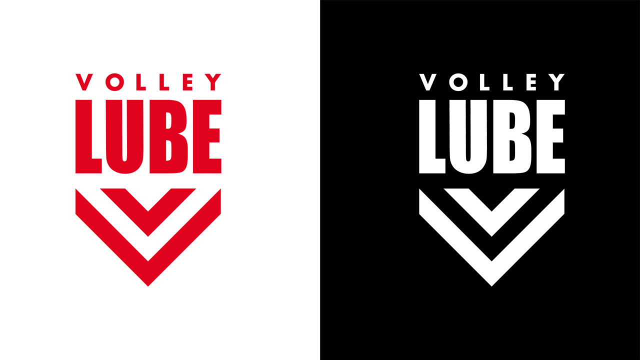
The new logo, seen in the headline above, comes in both a red-and-white version and a monochromatic black-and-white. It includes the club’s “core name,” Volley Lube,” and an arrow-pointing pattern that represents stylized versions of the letter V and the letter L, with the latter being rotated 45 degrees.
This is the 4th logo in the history of the club, and was designed by Cristina Vincenzi, a graduate of the Academy of Fine Arts. The old logo was used from 2006 onwards
The new logo coincides with a new version of the website lubevolley.it. The logo doesn’t include an actual volleyball in it, which has become a trend for many clubs’ new logos, with straight lines being more en-vogue than the round shape of a ball in modern graphic design.
Lube finished 2nd in the Champions League after pushing Russian side Zenit Kazan to a 5th-set in the gold medal match. Domestically, they finished in the same position, losing out to Sir Safety Conad Perugia in both the regular season table, and by 3 games to 2 in the finals of the playoff.
Now-retired logo from 2006-2018:

Prior Volley Lube logo:

We were unable to locate an image of VolleyLube’s original logo. If you have one, please email it to [email protected]!

It’s quite simple but it has certain message and I like it. I was always fond of sport logos. Perhaps I could be a designer, but I am a doctor : ) Though, I like all these sport thing. Recently i have noticed cool gallery https://www.logaster.com/gallery/sports-logo/ Check it you will many good ideas.