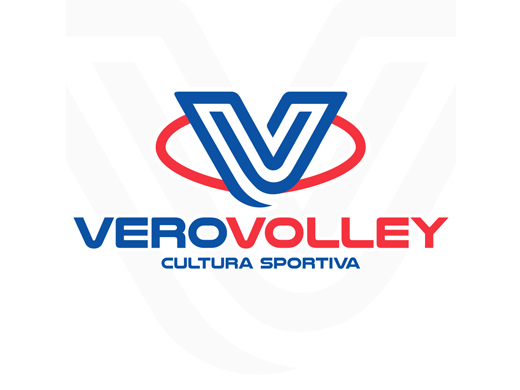
VeroVolley will turn 10 years old in 2018. To celebrate the anniversary, the team has just unveiled its new logo in its official website. Here is how the team described it:
“For ten years Vero Volley‘s logo was a smile and there could not have been a better logo for the energy, the enthusiasm, the passion that the team had at that time. But Vero Volley now looks at a new volleyball, at the “sport of the future,” where the management aspects count as much as the sporting merits to continue to be a national excellence center. The team presents itself tomorrow with a business card like the one represented by the new logo: an image projected towards the future. From today the image of Vero Volley will be as such, as this logo will represent all of the team’s activities.
The new logo is not a simple review of the previous one, although it confirms some distinctive elements, but an authentic “restyling” for the second life of Vero Volley: it will be a double “V”, dynamic and modern, blue, closed in a red circle, accompanied by its claim, Cultura Sportiva, which for the activity of the first teams, instead, will be replaced by “Monza.”
Here is how team president Alessandra Marzari presented the news:
“Our new logo represents us for what we have become today, but it is also the best testimony of the path we have made in these ten years. Before 2008, when the idea of the Vero Volley Consortium was born, with our first teams we took part in the regional championships and, perhaps, we would never have thought of getting where we are and of becoming the structure that today is brought up as an example in sport management. I still remember when we celebrated the first time the youth team qualified for the provincial finals, now we celebrated a few days ago the first championship of our history and next season we will also take part in the European Cups . The new logo represents this: our vision, our objectives, our idea of Sport Culture and management, of innovation. It’s what Vero Volley has become and wants to be in its future.”
When comparing the old logo with the new one, one quickly sees that it doesn’t include an actual volleyball in it, which has become a trend for many clubs’ new logos, with straight lines being more en-vogue than the round shape of a ball in modern graphic design. This was also evident in Lube’s recent new logo design. The new Vero Volley logo also does away with the serif font type that has become font non-grata for graphic designers (serif referring to the little tails and embellishments on the ends of letters).

Vero Volley‘s old logo – Courtesy of http://www.legavolley.it

Leave a Reply