When it was announced before the beginning of the Volleyball Nations League that free live streams of matches would no longer be available, instead each country would have a local partner that owned the rights to the streams. It was a bit disheartening to fans, because around the world would also have to pay to watch FIVB events. Volleyball fans had grown accustomed to watching for matches free on YouTube the last couple of years. Additionally, some countries would still be able to watch on network, cable or satellite television. In this article, I wanted to show how the presentation of the sport has changed in its look from 2017 to this year.
Now that we have had five full weeks of the FIVB Women’s Volleyball Nations League and four full weeks of the FIVB Men’s Volleyball Nations League, some of the early displays from the first week have been adjusted to be easier to watch for fans/subscribers.
We already know that the Volleyball Nations League is a much more grueling tournament with 15 matches over 5 weeks, when compared to 9 matches over 3 weeks in the World Grand Prix and World League, so the format is different.. In this article, however, we will focus on broadcasting look and other things show what differences have happened from last year.
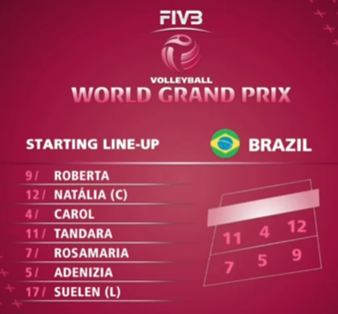
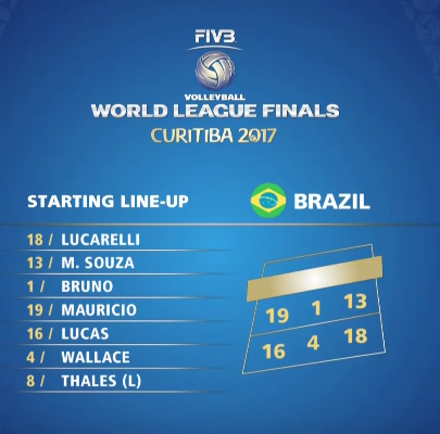
First we will look at the display of the starting lineup. With the 2017 World League and 2017 World Grand Prix look very similar.
Courtesy FIVB
Courtesy FIVB
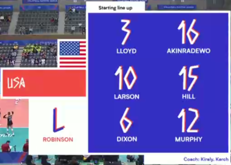
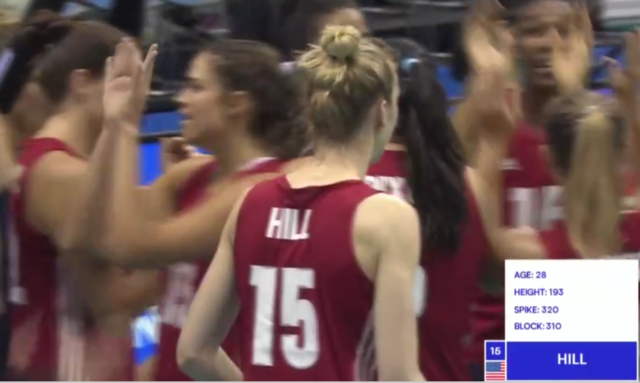
With the new identity of the Volleyball Nations League, the look is very different with the player name and number assigned to the different positions on the court. The libero is very large in the display, but does not use the number compared to the other positions on the court. This has been the same for the men’s displays as well. I do not like the font for the numbers and the country. Originally the FIVB was using the font more frequently and they have cut back on the usage because it was hard to read.
Courtesy FIVB
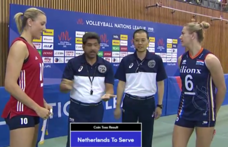
One of the things that the FIVB/IMG broadcast has added this year compared to the World League and World Grand Prix is the pre-match coin toss for choice of serve and side of the court.
Courtesy FIVB
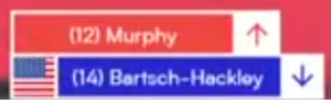
Also during the warmups now, the Volleyball Nations League has started to identify leading players to the viewers.
Courtesy FIVB
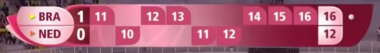
When the match starts the scorebug in the upper left corner has also changed. In 2017 between the World League and World Grand Prix, it was hard to tell the colors between the two teams and the dot for the serving team was at the right side. Additionally the bug had some odd angles
Courtesy FIVB
Courtesy FIVB
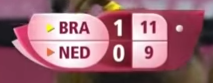
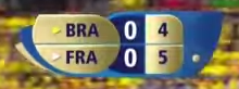
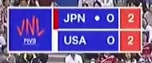
Now with the Volleyball Nations League, the scorebug has been redesigned into a rectangle. The VNL logo is now on the left, each country’s color is clearly visible and the dot for the serving team has shifted to the right of the country abbreviation. The red box hold the score for the current set.
Courtesy FIVB
The scoring run breakdown during timeouts, is something we have not seen this year with the Volleyball Nations League compared to the World League and World Grand Prix.
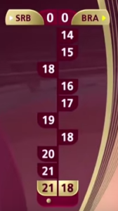
Courtesy FIVB
Courtesy FIVB
With substitutions the World Grand Prix and World League kept the two players very separate.

Courtesy FIVB
However with the new design, both players are shown at the same time.
At the end of the sets, the display for the points scored by spikes, aces, blocks and errors look similar between last year and this year. The main difference is that the score is between the countries at the top.
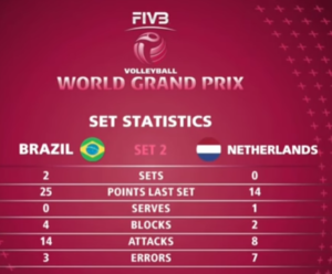
Courtesy FIVB
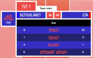
Courtesy FIVB
People have complained that the numbers sometimes do not total properly at the end of sets and also at the end of matches. This is unacceptable to fans of the sport.
One of the interesting things that I have seen infrequently so far in the Volleyball Nations League is challenges remaining display with the score below. In this match USA vs. Brazil, Brazil had used their two challenges and lost on both of those challenges in the first set, and there were empty circles displayed. I would prefer that there be no circles, if the challenges had been used and lost, or just use a number.
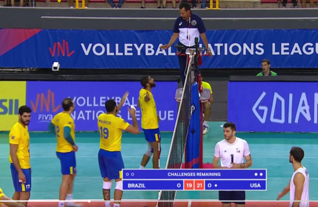
Courtesy FIVB
After looking at the differences, there are some improvements with the design of the scorebugs and displays. The FIVB and IMG need to watch use of the VNL font as too much of it makes it really hard to read.
Leave a Reply